How I Use Cursor to Validate Ideas


At Wayground, I often need to test ideas before we commit engineering time to them. Figma prototypes work for some things, but when you need real data, real inputs, and real AI responses, you need something that actually works.
That's where Cursor comes in. I use it to build functional prototypes I can put in front of users and learn from.
Instead of writing another "how to use Cursor" guide, I'll walk through an actual project I built recently. Step by step, from planning to deployment.
Just want to see the result?
The Problem We Wanted to Solve
In US middle schools, students write essays in English Language Arts. Narrative, argumentative, informative. Each type has specific rubric traits: hook and opening, story structure, descriptive details, transitions, voice and tone, conclusion.
Here's the problem: students practice on pen and paper, then submit their work and wait. They don't know if they're on track until a teacher grades it days later. And teachers? They can't possibly give detailed feedback on every practice essay from every student. There's just not enough time.
We saw a gap. What if students could get instant feedback while practicing? Not a grade, but guidance. "Your opening is strong, but your transitions need work." Something that helps them improve before the test that actually counts.
The question wasn't whether we could build this. The question was whether students would actually use it. Would they understand the feedback? Would it help them improve? Would they care?
To find out, we needed something real to test. Not a Figma prototype with fake data. Something where they could actually write an essay and see what happens.
Before Opening Cursor: The Planning Phase
Framing the Problem
I've learned that the quality of what Cursor builds depends entirely on the quality of what you feed it. Garbage in, garbage out. So before I write a single prompt, I answer four questions:

I do this planning in FigJam rather than a document. Something about the visual format helps me think more clearly.
Defining the Structure
Once I know what I'm building, I sketch out the app structure. What pages exist? What happens on each one?
For EssayPulse, it's simple:
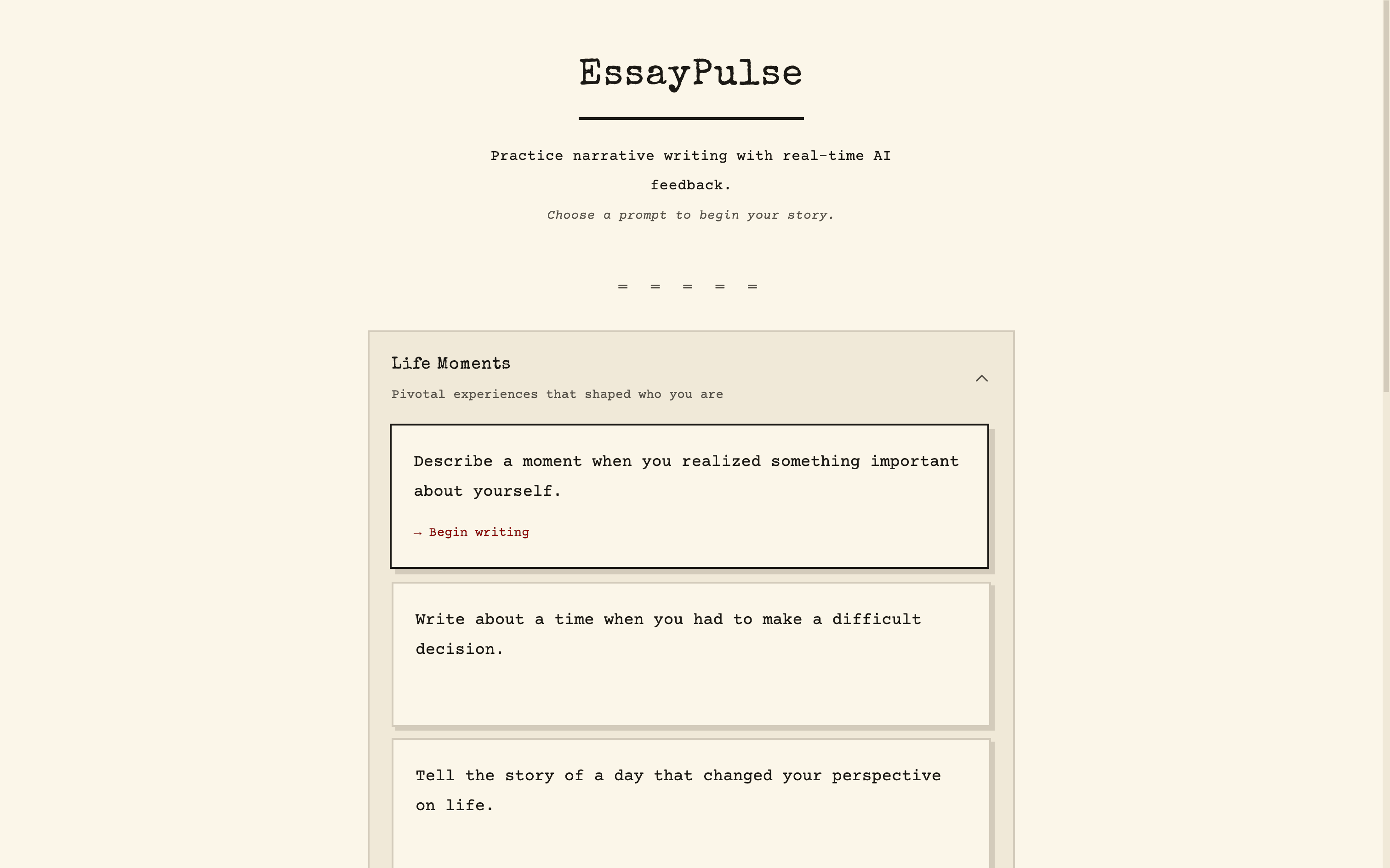
PAGE 1: PROMPT SELECTOR
App name and description
Categories of prompts (Life Moments, Relationships, Challenges, etc.)
Click a prompt to start writing
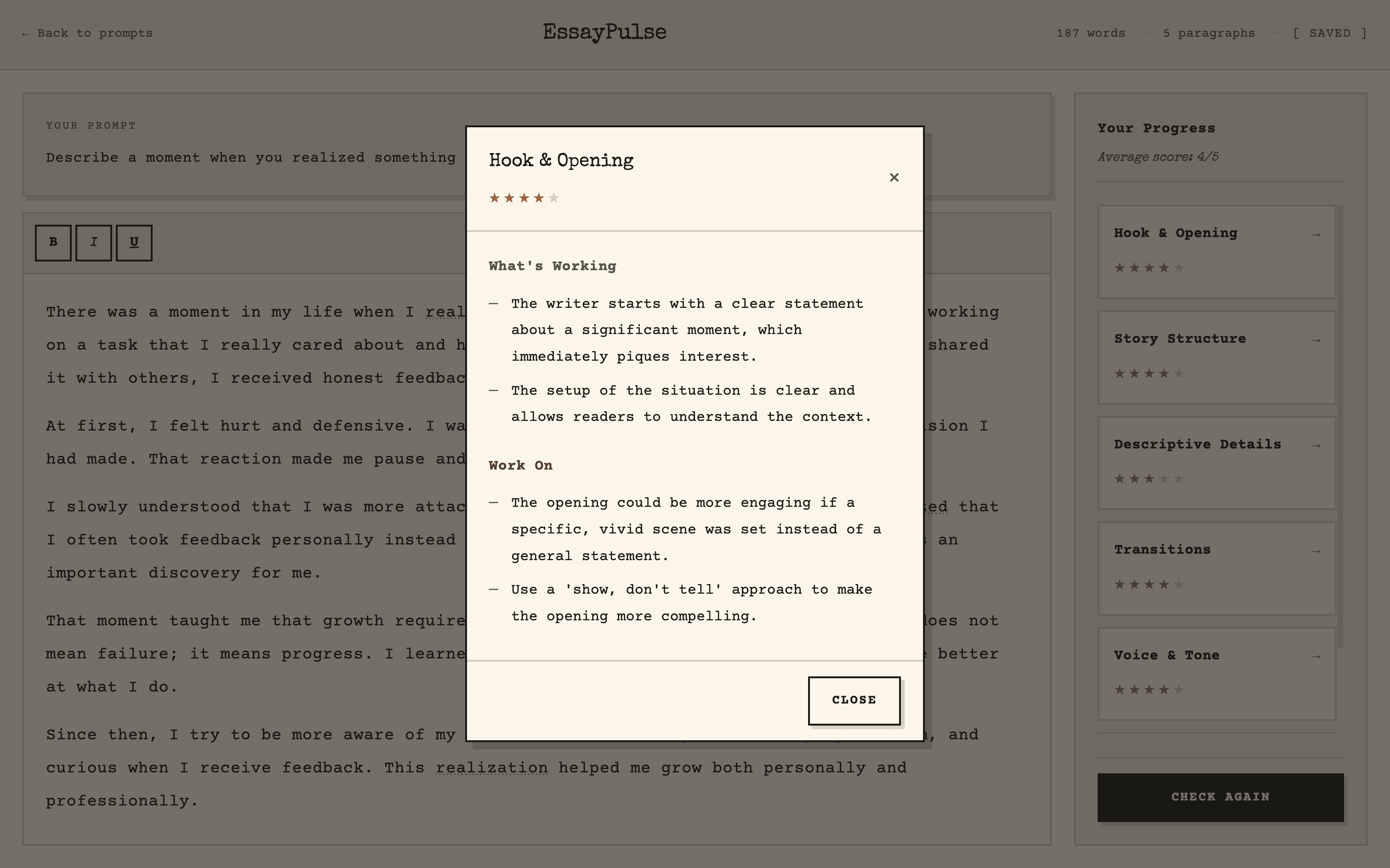
PAGE 1: WRITING PAGE
The selected prompt at the top
Rich text editor on the left
Rubric traits sidebar on the right (six traits, each with a star rating)
"Check your progress" button (enabled after 150 words)
Clicking a trait opens detailed feedback: what's working, what to improve
A rough sketch on paper helps here. Nothing fancy. Just boxes and arrows.

The Tech Stack
This is where it gets intimidating for designers. But here's the thing: you don't need to know what tech stack to use. You just need to describe what you're building clearly enough that Claude can figure it out.
That said, I've landed on a default stack that works for most prototypes:
FRONTEND
React + Vite + Tailwind CSS
BACKEND
Convex
DEPLOYMENT
Vercel
APIS
OpenAI
RICH TEXT
Tiptap
If you're unsure, just tell Claude what you need and ask it to recommend a stack.
The Prompt That Builds the App
Here's the template I use to describe any app to Cursor. I ask Claude to help me fill it out based on my planning notes:
Para 1 - Who & What Problem
This is a [type of app] for [target user] who want to [goal]. It solves the problem of [pain point].
Para 2 - How It Works
[User] lands on [first page] where they [action]. Once they [complete action], they go to [next page] with [key UI elements]. [Describe the interaction flow]. [User] can [repeat action] as many times as they want.
Para 3 - Pages
The pages to build are [list all pages].
Para 4 - Tech Stack
For the tech stack, use [framework] for the frontend, [library] for [specific feature], [service] for the backend, and [API] for [functionality].
Para 5 - Design Direction
The design should be [style adjectives], using [font type], [spacing], [corners], [shadows], and [color palette].
Para 6 - CTA
Create a thorough plan to build this application.
For EssayPulse, that became:
cursor-prompt.txt
This is a narrative writing practice app for students who want to improve their storytelling skills with real-time AI feedback. It solves the problem of students writing essays without knowing if they're on track until after submission or grading.
Students land on a prompt selector page where they pick from narrative writing prompts organized by category. Once they select a prompt, they go to the writing page with a rich text editor on the left and a rubric traits sidebar on the right. The sidebar shows 6 traits: Hook & Opening, Story Structure, Descriptive Details, Transitions, Voice & Tone, and Conclusion. Each trait displays a star rating out of 5. Once the student writes at least 150 words, they can click "Check your progress" to get AI-powered feedback. Clicking any trait opens a detail view showing "What's Working" and "What to Work On." Students can edit and re-check as many times as they want.
The pages to build are the prompt selector page and the writing page.
For the tech stack, use Vite + React + Tailwind CSS for the frontend, Tiptap for the rich text editor, Convex for the backend, and OpenAI API for scoring and feedback.
The design should be clean and minimal, using serif fonts, generous whitespace, rounded corners, soft shadows, and a muted warm palette.
Create a thorough plan to build this application.
I use Opus 4.5 for planning in Cursor. It breaks everything down into tasks, and if the plan looks right, I hit build.

What Came Out
One prompt. That's all it took to get a working app with:
A prompt selector with categories
A writing page with a rich text editor
Live word and paragraph count
A rubric sidebar with six traits
AI-powered feedback on each trait
"What's Working" and "What to Work On" sections


Did I need to add my OpenAI API key to Convex? Yes. Did the first "Check Progress" click throw an error until I did? Also yes.

But once that was set up, the core functionality worked.


Testing Reveals the Gaps
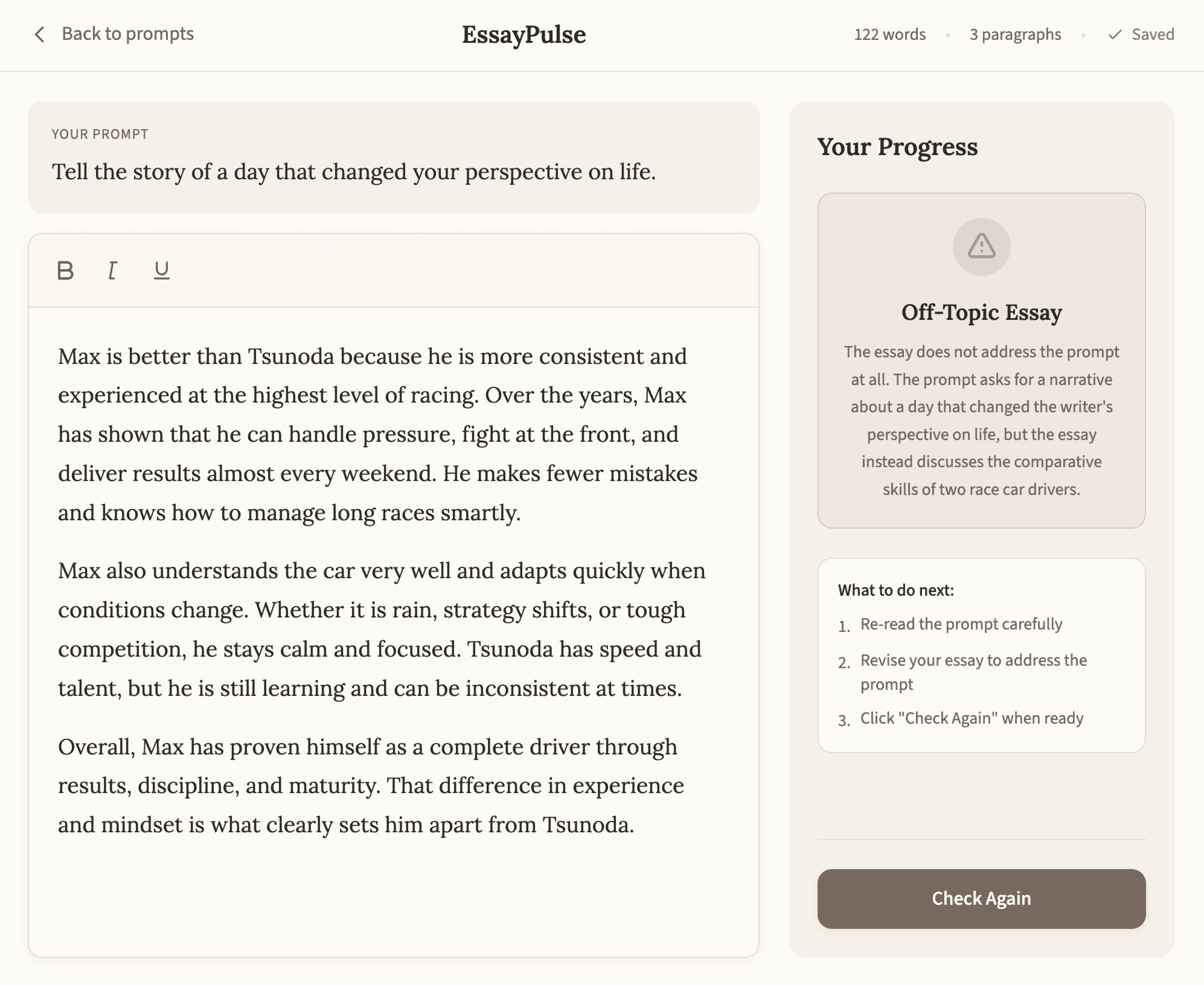
Here's where prototypes earn their keep. I started testing the app and immediately found a problem.
I wrote an essay about Formula 1 drivers for a prompt asking about "a day that changed your perspective on life." Completely off-topic. The system still gave me scores on all six traits.


That's a problem. Students might think they're doing well when they haven't even addressed the prompt.
So I went back to Cursor:
cursor-prompt.txt
When I go off topic, the traits still give me a score, which can create false expectations. How will the system detect whether the essay is on topic before assigning rubric scores?
A few prompts later, the app now:
1
Checks if the essay addresses the prompt before scoring
2
Shows a warning if it's off-topic
3
Explains why the essay doesn't match the prompt
4
Displays scores with a disclaimer that they reflect writing quality, not relevance

This is exactly why you build to test. A Figma prototype would never have caught this.
Making It Beautiful
Once the functionality works, I like to invest in the visuals. Not because it's necessary for testing, but because a polished prototype feels more real to users. They take it more seriously.
For EssayPulse, I wanted a typewriter aesthetic. The app is about writing, so leaning into that felt right.

My process:
1
Find inspiration on Pinterest (searched "typewriter aesthetic")
2
Open a new Cursor agent and ask it to describe the typewriter UI aesthetic
3
Have it create a design-guidelines.json file with typography, colors, textures
4
Ask Cursor to create a style guide page showing all UI components
5
Review and tweak until it feels right
6
Apply the style guide to the entire application

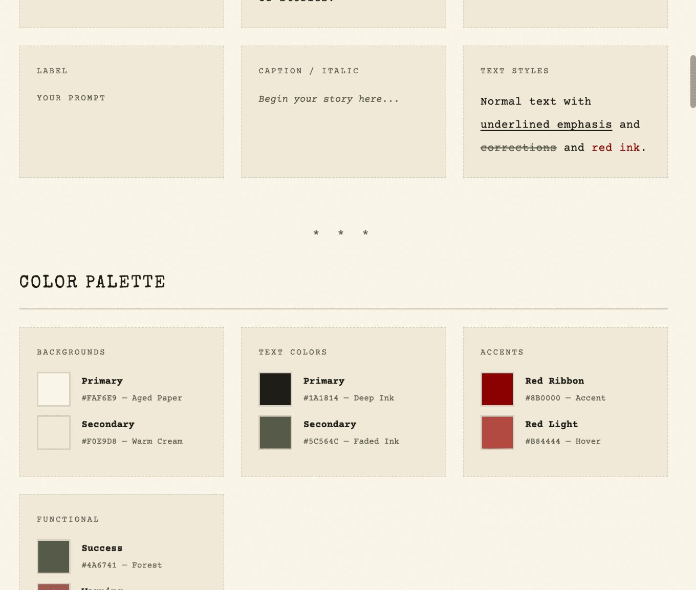
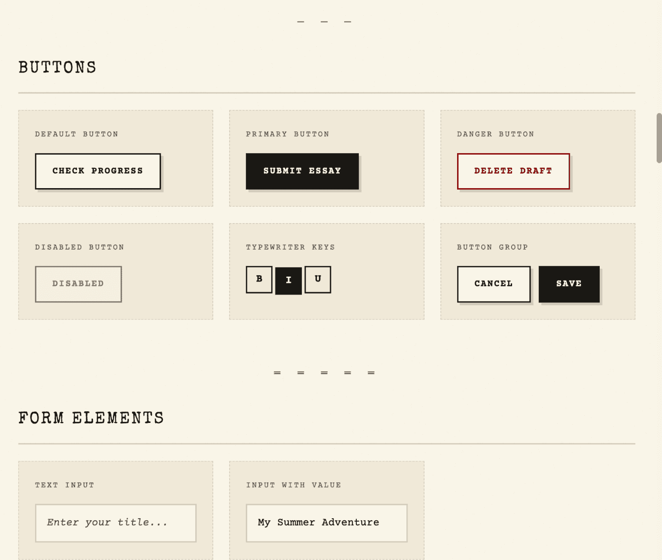
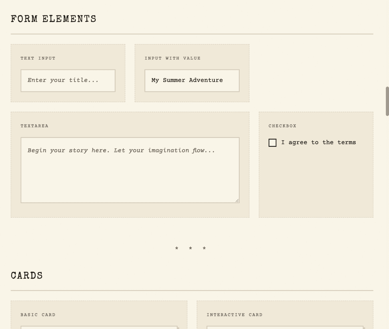
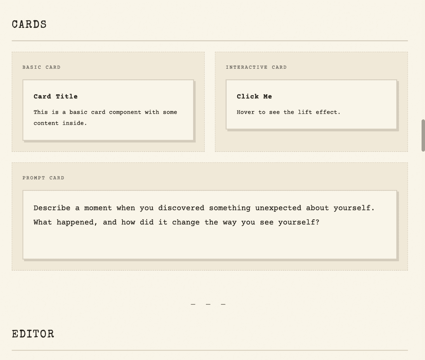


The result: monospace fonts, aged paper backgrounds, ink-colored text, typewriter-style buttons. The whole app transformed in a few prompts.

Ship It
Once I'm happy with the prototype, I deploy to Vercel. Git commit, push to main, and it's live. A real URL I can send to students for testing.

That's it. Try it yourself